We recently shared the news about the release of Safe Software’s FME Platform 2024.0. Alongside this update, the FME Form interface, a crucial workspace for all FME users, has undergone significant enhancements. Read on to find out more!
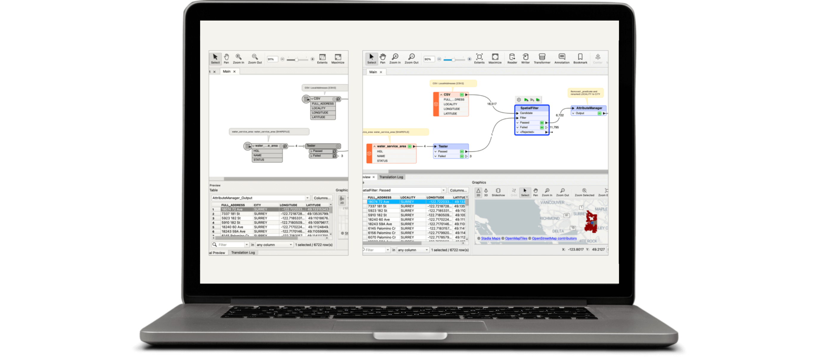
The updates to FME Form are in line with the improvements previously implemented in FME Flow. This ensures a consistent user experience when transitioning between FME Form and FME Flow. Safe Software has embraced a minimalistic design and prioritized ease of use, refining many interface elements. While these changes may appear cosmetic, they are rooted in Safe Software’s user-centric design philosophy, making the software more enjoyable to use. These enhancements help create workspaces that are not only easier to organize but also visually more appealing, boosting productivity and focus.
So, what exactly has changed in FME Form? Let’s take a closer look:
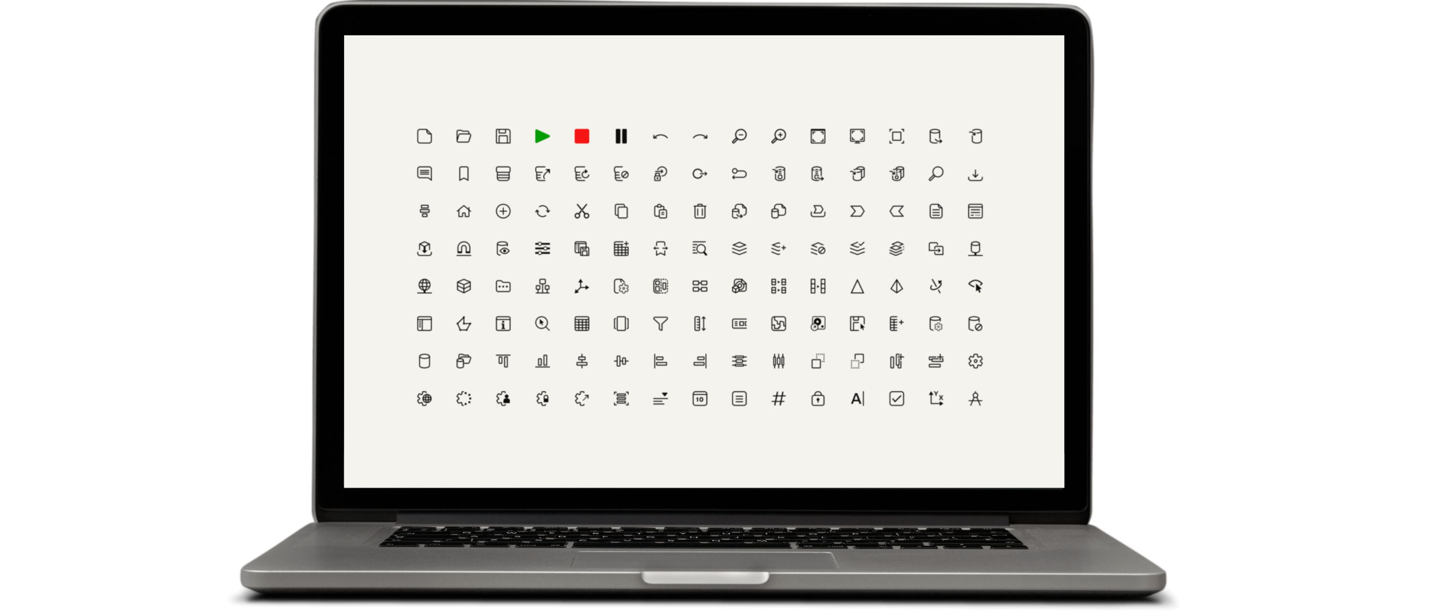
A new icon system for improved convenience
This visual redesign was shaped by an extensive audit and feedback from Safe Software’s user community. The new icon system is crafted to help users focus and work without interruptions. The icon colors are designed to guide users towards the next likely action at each stage of the authoring process. In addition to color, Safe Software has enhanced the appearance of certain icons. Here are some highlights:
- Navigator icons are red only when representing an incomplete transformer or parameter.
- Toolbar icons are green only when indicating a data translation is running.
- A red warning icon appears only on incomplete transformers.
Minimal design for work efficiency
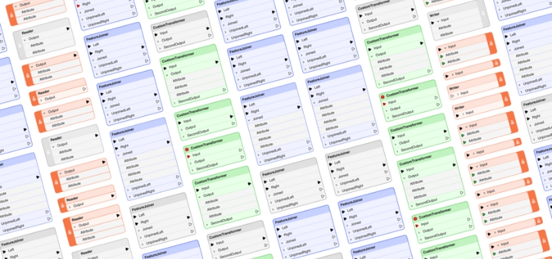
Thoughtful design choices, such as the rounded corners of visual elements and a harmonized color palette, allow users to create workspaces that are not only visually appealing but also foster a sense of calm and focus. This commitment to a minimal yet effective design philosophy ensures that working with FME is as rewarding as the results it helps achieve.
A fresh look that preserves proven elements
By listening to their users’ needs, the FME creators embrace change while adhering to the principle of “if it isn’t broken, don’t fix it.” They have preserved the core elements and color semantics that have been fundamental to the FME experience.
What didn’t change?
- Safe Software has maintained the semantic use of color in the canvas and icons. For incomplete objects or parameters, the color red is still used.
- The same color families are employed for different objects on the canvas, ensuring that existing users do not have to relearn what each object represents.
- Symbols representing various concepts and actions have been preserved, as long as they do not create inconsistencies with the rest of the icons.
That’s all!
We encourage you to explore the new release of FME Form. If you have any questions, don’t hesitate to contact us!


