The new release of GeoTask, a Field Service Management solution, is now available, bringing many improvements in performance and functionality. What is new in GeoTask 17 dispatcher and fieldworker applications? Learn what our developers prepared to make managing fieldwork even easier.
GeoTask 17 comes with many improvements. In this release, we focused mainly on improving the dispatcher application and handling a large volume of tasks and the work of many people in the field. Let’s explore the detailed changes!
User-friendly interface – dispatcher application
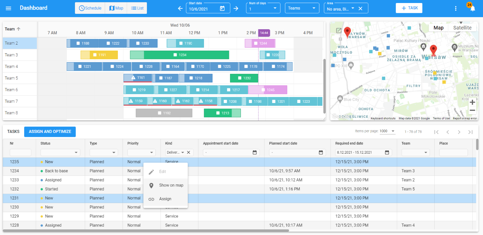
The GUI of the dispatcher web application is adapted to the design of the mobile application. All changes improve GeoTask user-friendliness and make it more intuitive and easier to use. Dispatcher planner consists of 3 tightly integrated elements: Gannt chart (1) , map (2), and list of tasks (3). For example, a task selected on the Gantt highlights in the task list, and a pin appears on the map showing its location.

While working on the GeoTask UX/UI, we focused on the clarity of the Gantt chart – the dispatcher should get a clear message about the work status with just a glance at the app.
The tasks have different colors for different statuses of the tasks and shapes for kinds of tasks. For example, if the execution time of the tasks overlaps, the task tile turns red. Thanks to this, the dispatcher can notice the conflict and immediately correct the plan.
For even more clarity, we added another feature: if the tasks of a technician/team overlap, then the plan for this technician is broken into several lines, and you can see all the tasks one below the other (see picture below, Team 3).

- Directly on the Gannt, you can select which columns are displayed, so the application shows only the information you are currently using. You can also adjust the width of the columns by clicking and dragging, which is useful in case of or a wordy team name.
- You can sort the information in the columns and change the column order on the Gannt.
- You can also change the Gantt diagram size by grabbing it in the lower right corner simply by clicking and dragging. Increasing or decreasing the Gantt diagram size also changes the task list and map size.
- You can hide elements like the map, task list, and Gantt chart if needed, and display only the information you are currently using. The application will adjust the size of the schedule window to the screen width.
- You can also zoom in/out of the schedule on the Gannt. That is one of the most anticipated features, allowing us to see the tasks numbers.
- You can display any time interval (in previous releases only the whole day was available), e.g. you can display only the team’s working hours (6 AM – 9 PM).
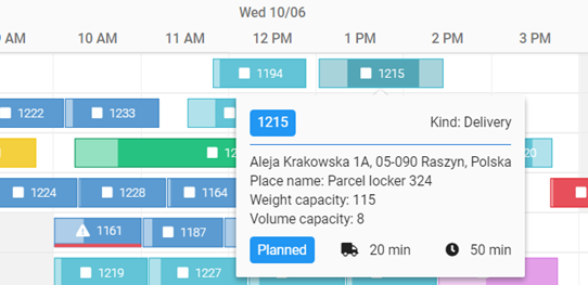
- Tooltips provide information about the elements (e.g. for the tasks: address/location, status, kind of task, travel time, duration time). You can quickly check the status of the task or how many people are on the team. You don’t have to switch to another view in the Dispatcher’s panel.

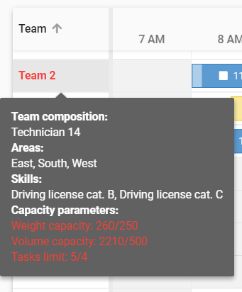
- Tooltips provide information about the exceeded capacity of a team. If the Team is assigned tasks that exceed the capacity: weight, volume, or the limit of tasks allowed, the team’s name on Gantt is displayed in red. After moving the cursor over the name of the Team in the tooltip, exceeded parameters highlight in red.

Context menu
We added the context menu on the list of tasks, Team column, and Gantt for smoother and more intuitive task management.
After hovering over and right-clicking on a task, the following options are available in the context menu:
Tasks list:
- Edit
- Show on the map (after the click, the map centers to the task location)
- Assign / Unassign.
Gantt:
- Edit the task status (e.g. sent, unassign, accept)
- Edit
- Show on the map
- Lock / unlock task.
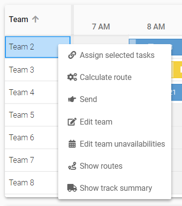
The Gannt context menu changes depending on the task status. The context menu is also available for Teams. After hovering and right-clicking on it, you can select the following:
- Assign selected tasks
- Calculate route
- Send
- Edit team unavailabilities
- Show route
- Show track summary.

A new way to filter the list of tasks
We added new filters for efficient planning: area and teams. With that feature, you can select several areas. The tasks from the selected area are displayed on the task list and the map, and on the Gantt shows the teams to which technicians from these areas are assigned.
We also added the option of searching in the filtering field. Once you start typing the name, the dictionary will show available options. A user can select any number of values by marking an item with a checkbox on the dictionary list. We moved the team filter to the top of the panel.

There are new data filters on the lists. Now the filtering is more precise, which makes it easier to manage a large volume of items.
Filters allow you to quickly find and preview the information in one view, e.g. you can display all tasks in progress scheduled for the next day.
We improved selection of dates – when planning, you can select preferred dates from the calendar by filtering.
Easier scheduling and teams creation
The dispatcher can plan the work by selecting technicians from several areas at once. When creating a team, the dispatcher can only see the technicians who are not assigned to any tasks or teams, without the risk of double-booking a technician. The dispatcher is allowed to view and edit technicians’ skills and modify the working hours while scheduling.
Changing the way of commands execution
In GT 17, we changed how the team’s unavailability is edited. You can select the option in the context menu on Gantt or in the main menu (Main menu > Settings > Team > Unavailabilities tab).
The dispatcher can register cycling and onetime unavailability, resulting in efficient planning and scheduling. We also changed the task assignment and scheduling.
Mobile app – transfer data consumption
We improved a couple of features in the mobile app, mainly to minimize the data transfer.
Attachments download
To reduce the transfer usage/consumption, attachments of the task (added in the dispatcher panel) are not immediately transferred to the mobile device. The technician can decide whether to download all attachments or selected files.
Pictures quality and size
Another way to reduce the data transfer and improve the smoothness of operations is to minimize the pictures’ size. The system’s admin can configure the preferred size and quality of graphic files attached to the tasks.
Progressive Web App
We saved the biggest change for the end. The dispatcher app was re-written on the Angular 12 framework. Thanks to this, GeoTask runs faster, smoother, and complies with modern network standards. It will make it easier to develop new enhancements and custom solutions.
The app is built in accordance with PWA (Progressive Web Application), meaning it’s adapted to write an application as a native application. Once installed, the application is available on your computer like any other application. You can create a desktop shortcut and pin the application to the taskbar.

In the browser in the address bar of the application page, you will find the following options – Install GeoTask application.
What else can we do for you?
GeoTask allows you to effectively manage a large number of tasks in the field. With GeoTask you can schedule work in a contact-free manner, which is important especially in times of pandemics. See how we can help you and try out the new version of our software:


